Preparing the latest guides, releases, and feature request updates.
Loading guides
Preparing the right Knowledge Base content for this platform.
Configure the UI Composer for custom layouts | Chamevo Support Center
Configure the UI Composer for custom layouts
Build custom product customizer interfaces with the UI Composer — control layout, modules, actions, the element toolbar, custom CSS, and guided tours.
Updated April 28, 20265 min read
The UI Composer lets you design the interface your shoppers use to personalize products. You control which panels, tools, and actions appear — and you can build more than one interface, so an apparel product and an engraved sign can each get a layout that fits.
Every product uses a default interface unless you assign it another one. You can edit that default, or create separate interfaces for different product lines.
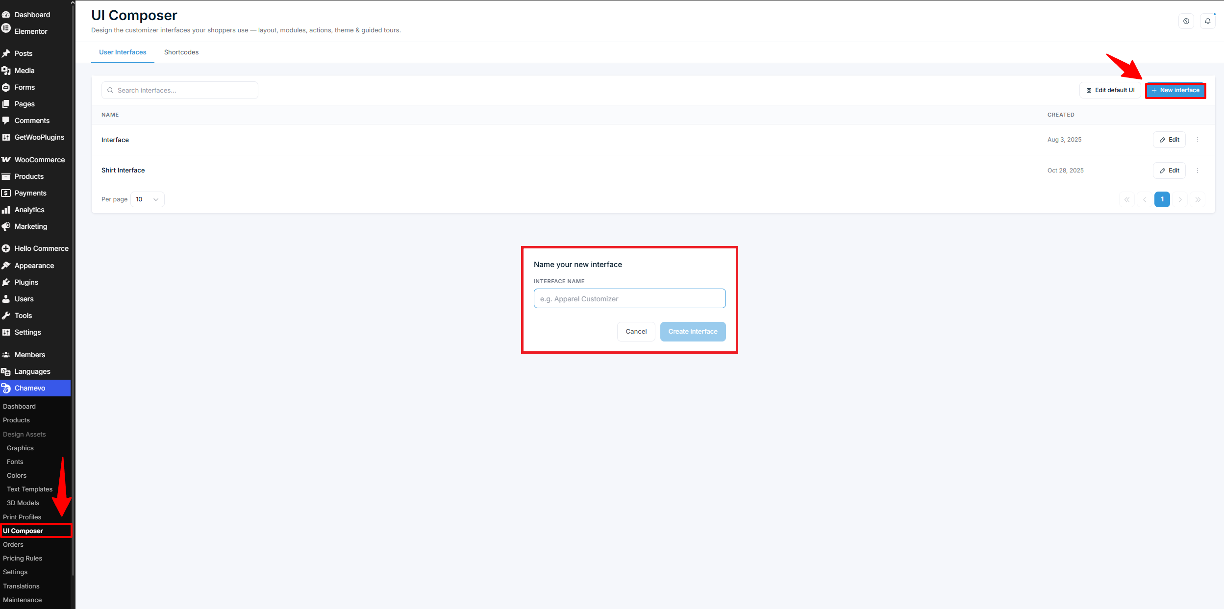
Edit default UI — change the baseline interface every product uses by default.
New interface — build a separate interface. Give it a clear name like "Apparel Customizer".
Duplicate — copy an existing interface as a starting point.
Delete — remove an interface. Products assigned to it fall back to the default interface.
Use the search box to find an interface by name when the list grows.
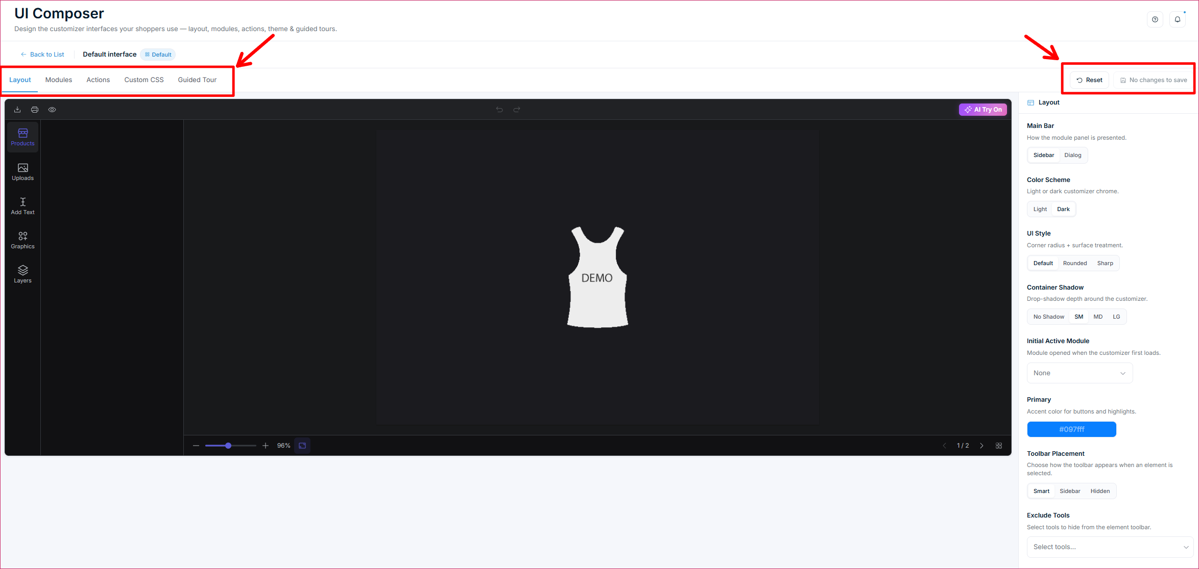
Click Edit on any interface to open the editor. The editor has five tabs — Layout, Modules, Actions, Custom CSS, and Guided Tour — plus Reset and Save in the top-right corner.
Layout tab: appearance, dimensions, and the element toolbar
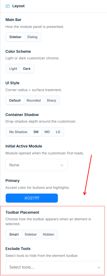
The Layout tab controls how the customizer looks, how tall it is, and how the element toolbar behaves. It has eight appearance settings plus a Dimensions section:
Main Bar — show the module panel as a Sidebar or a Dialog.
Color Scheme — Light or Dark customizer chrome.
UI Style — corner and surface style: Default, Rounded, or Sharp.
Container Shadow — drop-shadow depth around the customizer: No Shadow, SM, MD, or LG.
Initial Active Module — the module that opens first when the customizer loads. Choose None or pick a module.
Primary Color — the accent color used for buttons and highlights.
Toolbar Placement — where the element toolbar appears when a shopper selects an element.
Exclude Tools — hide specific tools from the element toolbar.
Set the customizer height per device
The Dimensions section sets how tall the customizer is on desktop, tablet, and mobile. No CSS required.
Above the preview sits a Desktop / Tablet / Mobile switch. It does two jobs: it resizes the preview so you see the layout at that width, and it selects which device the three Dimensions fields apply to.
Select a device with the switch.
Set Height — the target height of the customizer.
Set Min Height — the smallest height it can shrink to.
Set Max Height — the largest height it can grow to.
Switch device and repeat, then click Save.
Each field takes a number and a unit: px, %, vh, vw, or rem.
Min Height floors the height and Max Height caps it. Both beat the Height you type. If the customizer stays shorter than you set, raise Max Height — the built-in default is 70vh, which wins on short screens. To lock an exact height regardless of viewport, put the same value in all three fields.
Empty means inherit. Leave a field blank and that one value falls back to the next wider device: mobile inherits from tablet, tablet from desktop, desktop from the built-in defaults (700px height, 500px min height, 70vh max height). The greyed-out number in an empty field shows what it will inherit. Inheritance works per field, not per device — a mobile Height with an empty Min Height still uses tablet's Min Height.
The breakpoints are fixed: tablet applies at 1024px and below, mobile at 768px and below.
For heights these three fields cannot express — a calc() expression or a custom breakpoint — use the Custom CSS tab. Hand-written CSS wins over the Dimensions fields, so you can override one value there without clearing it here. See custom CSS for the product customizer.
Set where the element toolbar appears
When a shopper clicks an element on the canvas, a toolbar appears with editing options. Toolbar Placement controls where:
Smart — floats near the selected element.
Sidebar — docks the toolbar in the sidebar panel.
Hidden — hides the element toolbar entirely.
Exclude tools from the toolbar
Use Exclude Tools to hide tools you don't want shoppers to use. Click the field and select any tools to remove:
Edit Text
Color
Font Family
Text Size
Text Format
Curved Text / Effects
Image Filters
Transform
Position / Layer Order
Duplicate
Remove Background
Remove
For example, hide Font Family and Color to lock text to your brand font and palette. Excluded tools apply only to this interface.
Modules tab: choose the main-bar panels
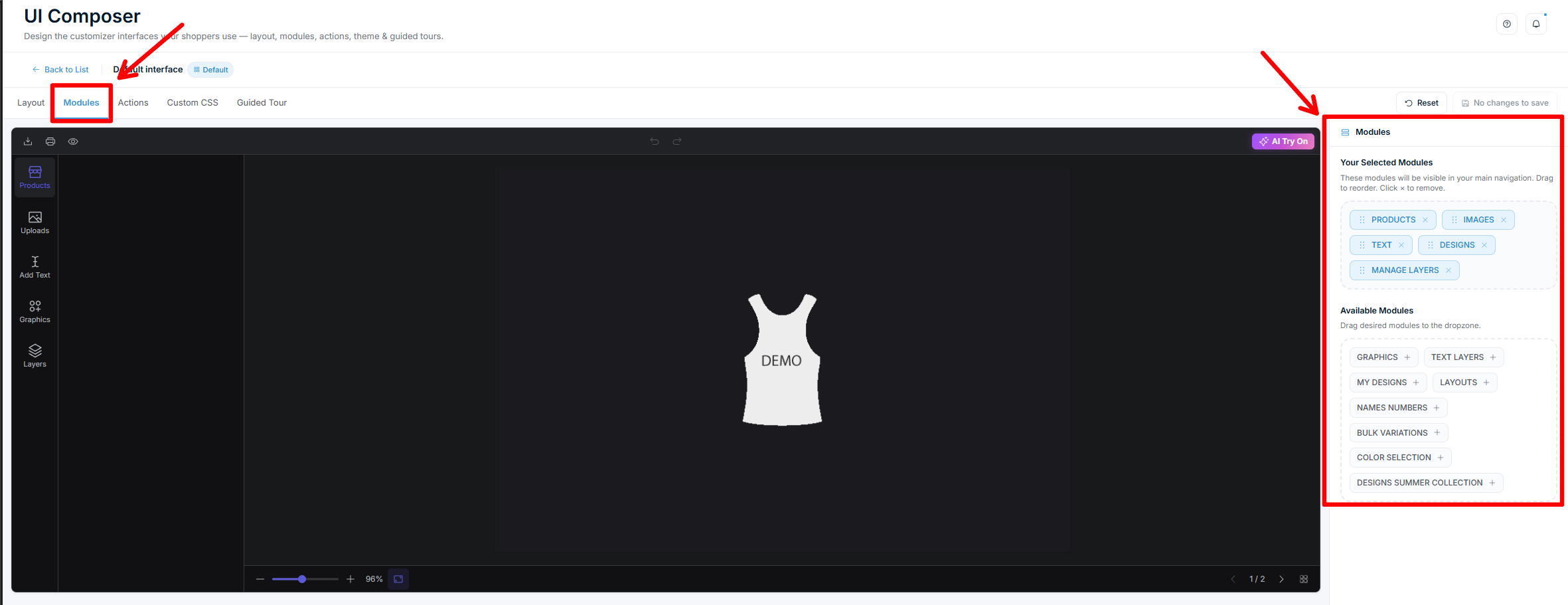
Modules are the panels in the customizer's main navigation — like Products, Images, Text, and Designs. This tab has two areas:
Selected Modules — the modules shown in the main bar. Drag the grip to reorder them. Click × to remove one.
Available Modules — modules not currently shown. Drag one into Selected Modules, or click + to add it.
New interfaces start with Products, Images, Text, and Designs. Add modules like layers, names & numbers, or bulk variations when your product needs them. See work with text elements and the other module guides for what each panel does.
Print Areas is one of the available modules. It gives shoppers a panel that steps through a product's print areas one at a time, each with its own artwork preview — useful for multi-panel products. See let shoppers step through print areas.
Actions tab: arrange the action bars
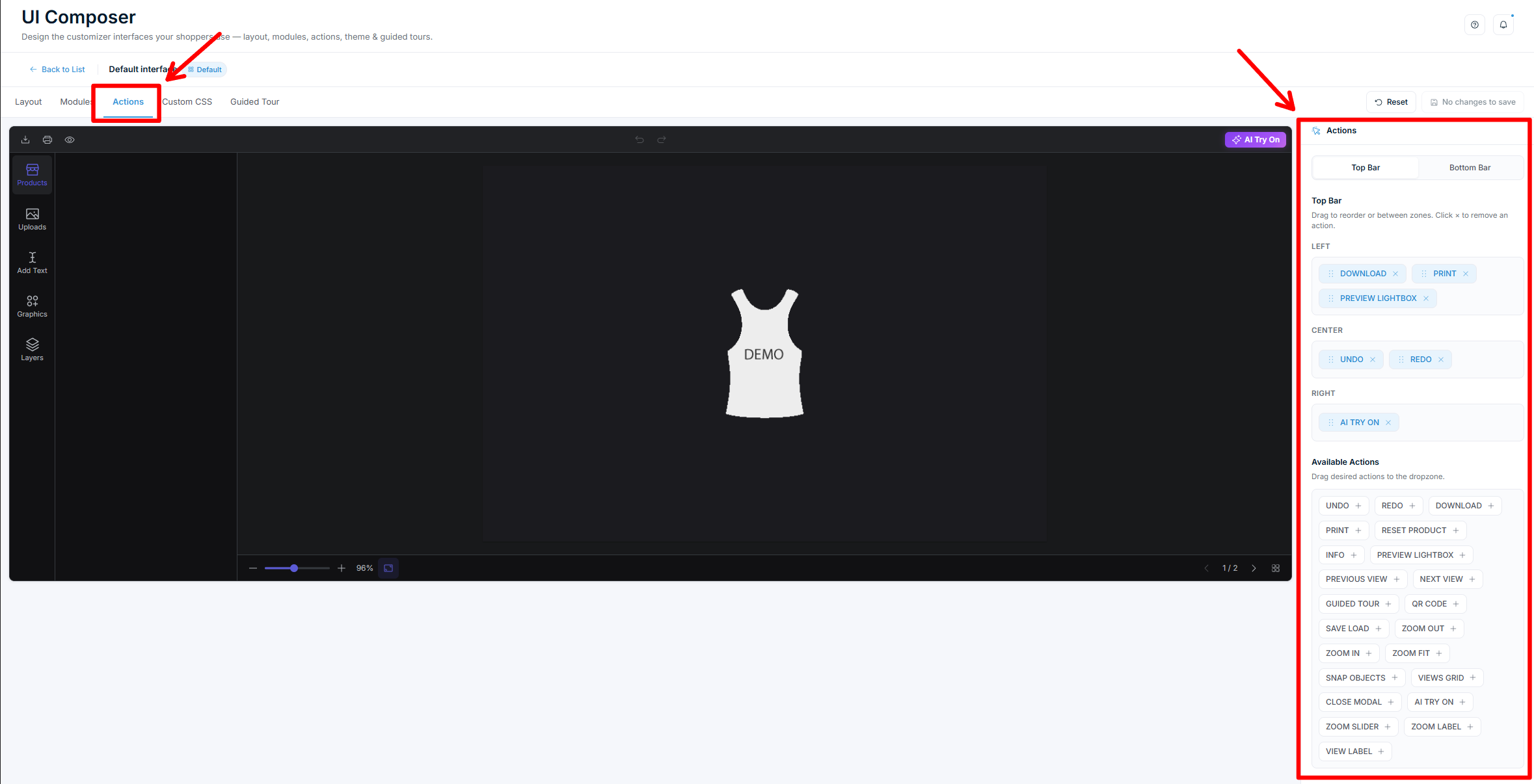
Actions are buttons like Download, Print, Undo, Redo, and Info. You place them in two bars:
Top Bar — three zones: Left, Center, Right.
Bottom Bar — two zones: Left, Right (used for zoom and view controls).
Switch between the two bars with the segmented control at the top. To add an action:
Click a zone to select it (it highlights).
Click + on an action in the Available Actions pool.
You can also drag an action straight into a zone. Drag actions within a zone to reorder them, or click × to remove one.
Custom CSS tab: fine-tune the styling
The Custom CSS tab is a code editor for style overrides that apply only to this interface. Use it when the Layout options don't go far enough — for example, to adjust spacing or match a specific brand look.
Target the customizer scope and use the customizer's CSS variables for theming. For a reference of selectors and variables, see custom CSS for the product customizer.
@media rules written here do not affect the preview. The device switch emulates a device by resizing the preview frame, not the browser window, so media queries never fire inside it. Test responsive CSS on the storefront at a real window width.
CSS in this tab loads after the height rules the Dimensions section generates, so a height token you set here overrides the Dimensions fields.
Guided Tour tab: walk shoppers through the customizer
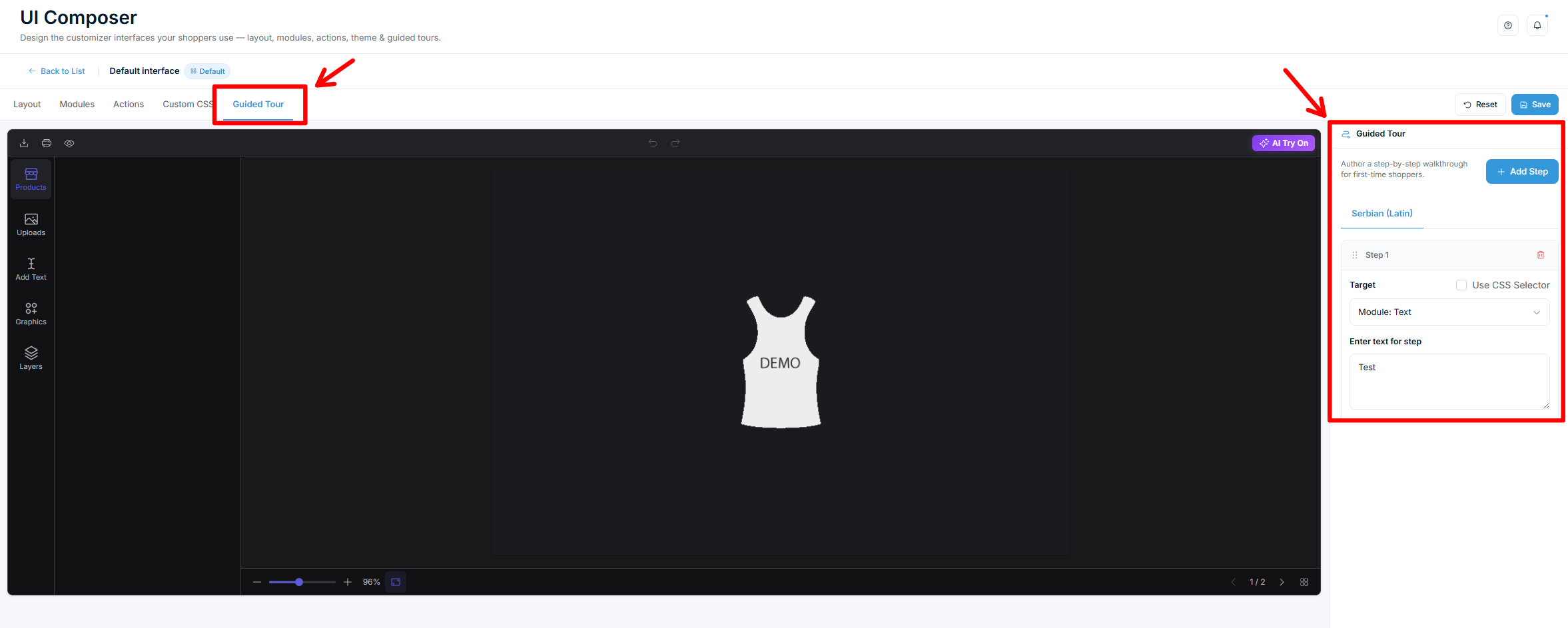
A guided tour shows first-time shoppers a step-by-step walkthrough of the customizer. Each step points at a part of the interface and shows a short tooltip.
To build a tour:
Open the Guided Tour tab.
Click Add step.
Set the Target — the element the step points to. Pick a Module or Action from the dropdown.
For anything not in the dropdown, tick Use CSS selector and enter a selector.
Type the step text shoppers will read.
Repeat for each step. Drag steps by the grip to reorder them. Use the trash icon to remove a step.
If your store runs in more than one language, the Guided Tour tab shows a language tab for each. Write the tour text separately per language.
Save and assign the interface
Click Save in the editor to store your changes.
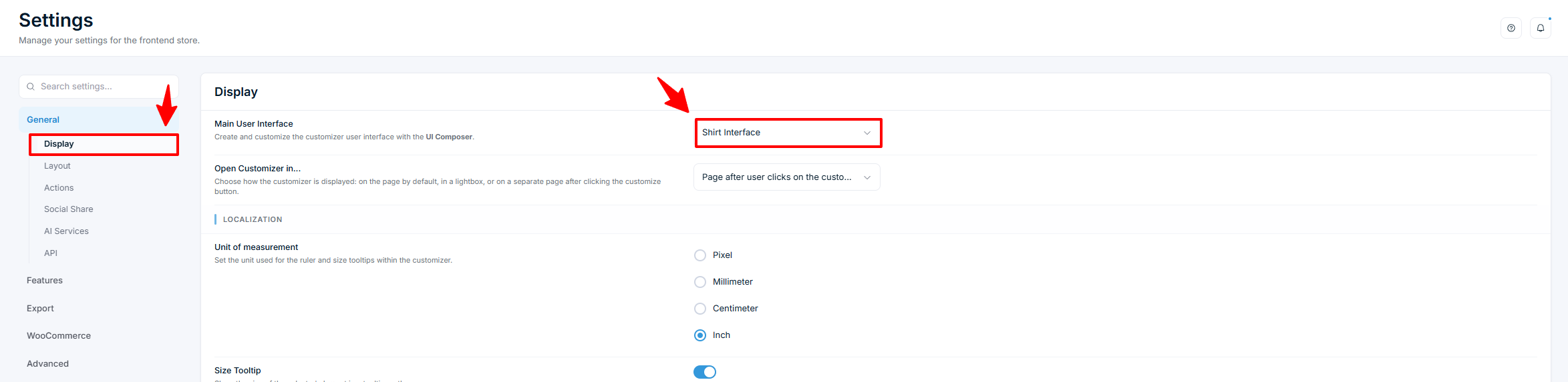
Go to Chamevo → Settings → General → Display.
In Main User Interface, select your interface from the dropdown. This sets the interface used across your store. Select Default to use the default interface.
The Reset button in the editor returns the current interface to the default layout. Use it if a change goes wrong before you save.
Interface patterns to start from
These combinations of modules and actions cover common product types:
Minimal (engraving, simple text): keep only the Text module. Trim the top bar to Undo, Redo, and Download. Use Exclude Tools to hide anything beyond basic text editing.
Full-featured (apparel, multi-element products): show Products, Images, Text, and layers. Add Download, Print, Preview, Undo, and Redo across the top-bar zones.
Photo-focused (phone cases, canvas prints): lead with the Images module, keep graphics secondary, and reduce text options.
Check your setup
Open a product page on your storefront and start customizing.
Confirm the modules, actions, and toolbar match what you configured.
Select an element and check that excluded tools are gone and the toolbar appears where you set it.
If you built a guided tour, confirm the walkthrough runs and each step points at the right place.
If you set Dimensions, check the height on a desktop browser, then narrow the window past 1024px and 768px to confirm the tablet and mobile values take over.
Test on mobile to confirm the interface is usable on small screens.
Troubleshooting
Changes don't appear on the storefront. Confirm you clicked Save, then check that Main User Interface in Settings points to this interface (or that the product's own interface setting does). Clear any caching plugin — see fix caching issues hiding the product customizer.
A tool still shows after excluding it. Exclude Tools is per interface. Make sure you edited the interface the product actually uses, then save again.
A module is missing on the frontend. The module must be added in the Modules tab and enabled for the product. Some modules also depend on product settings.
A guided tour step points nowhere. The target module or action must be present in the interface. If you used a CSS selector, confirm it matches an element in the customizer.
A deleted interface broke a product. Products fall back to the default interface after a delete. Reassign a different interface in the product settings if needed.
The customizer is shorter than the Height I set. Max Height caps it and defaults to 70vh, so on a short screen the cap wins. Raise Max Height for that device.
A Dimensions value has no effect. Confirm you set it on the device selected in the switch, that you saved, and that no height token in the Custom CSS tab is overriding it. Then clear any caching plugin.
My @media rule works on the storefront but not in the preview. Expected. The device switch resizes the preview frame, not the browser window, so media queries do not fire inside it.
Q: Can I use a different customizer layout for different products?
A: Yes. Create a separate interface in the UI Composer, then assign it to a product through its Chamevo product settings. Other products keep the default interface.
Q: How do I stop shoppers from changing the font or color?
A: Open the interface's Layout tab and use Exclude Tools to hide Font Family and Color from the element toolbar.
Q: What happens to products if I delete an interface?
A: They fall back to the default interface. Assign a different interface in the product settings if you don't want the default.
Q: Do I need to code to set up a guided tour?
A: No. Add steps in the Guided Tour tab and pick each target from the Module or Action dropdown. A CSS selector is optional for advanced targeting.
Q: How do I make the product customizer taller?
A: Open the interface's Layout tab, scroll to Dimensions, and set Height. Raise Max Height too — it caps the height and defaults to 70vh.
Q: Can I give mobile shoppers a different customizer height?
A: Yes. Switch the device selector above the preview to Mobile and set the three Dimensions fields. Mobile values apply at 768px and below.